
You've probably seen 300 ppi on spec sheets and scrolled right past it, yet on an E Ink screen, that little number is the difference between "yeah, it's readable" and "oh, this actually feels like paper." A 300 ppi e ink display makes fine serifs, margin notes, and PDFs look clean instead of grainy. Stick around, and we'll turn that tiny spec into something you can feel in your reading comfort and in how your handwriting looks on the page, and help you spot at a glance when a screen is actually worth spending hours with.
300 PPI Meaning on an E Ink Screen
What Is PPI?
PPI stands for pixels per inch, and it describes how tightly a screen packs its pixels into a given amount of space. Instead of telling you how big the display is, PPI tells you how many individual picture elements sit along one inch of the panel in each direction. The higher the PPI, the smaller each pixel becomes, and the more of them you can fit into the same physical area. On an E Ink screen, every one of those pixels is a tiny controllable point that can show dark pigment or stay light, so PPI is essentially a measure of how fine the grid is that your text, images, and handwriting are drawn on.
What Is 300 PPI?
300 ppi is a specific density level where the screen can place 300 pixels per inch horizontally and 300 vertically. Imagine cutting out a one-inch square from a 300 ppi E Ink display: that small patch contains ninety thousand pixel positions arranged in a tight grid. Each position can switch between black and the light background, and together they form the structure that shapes every letterform, icon, and handwritten stroke you see on the page.
How 300 PPI Works On An E Ink Display?
An E Ink screen uses microcapsules or microcups filled with charged black and white particles that move when a voltage is applied. You can think of each pixel on a 300 ppi ereader or tablet as a tiny tile on the surface of the display, made up of those particles. The device controls each tile as a single point, turning it dark or keeping it light. When the panel has 300 ppi, it simply means there are more of these tiles packed into every inch, so the screen can draw finer shapes in the same space. The PPI number doesn't describe brightness or contrast. It only tells you how many of those controllable points the panel fits into each inch.

Why 300 PPI Matters on E Ink Screens
Text That Feels Effortless To Read
On a lower-resolution E Ink panel, your eyes often end up doing hidden extra work because curves in letters look slightly stepped, punctuation feels a little soft, and certain typefaces lose their clean shapes when you shrink the size for comfortable long-form reading. In contrast, a 300 ppi display gives those same elements enough detail to look settled and stable, so you can follow the line of thought instead of constantly re-focusing on the letterforms themselves.
You feel the difference most clearly when you drop the font size. At 300 ppi, the screen has enough pixel density that:
- Small body text stays crisp even at compact sizes instead of dissolving into tiny stair-stepped edges.
- Serif fonts keep a clear contrast between thick and thin strokes rather than collapsing into a flat, muddy weight.
- Punctuation, diacritics, and special characters stay distinct, which makes multilingual reading less tiring.
In practice, you can keep your preferred layout instead of enlarging everything to see it, which is when an E Ink device finally feels like a tool you can read on for real.
More Content On Each Page
A 300 ppi screen lets you use slightly smaller fonts and denser layouts without your text turning into a blur, because the higher pixel density keeps letter shapes clear even when you shrink them a little. With more content visible at once, each page carries more of the story or argument, so you move through a book or document in steadier chunks rather than a few short lines at a time.
That extra density matters most when you:
- Read long narratives and prefer to set the font a touch smaller so you are not constantly turning pages, while the text still looks crisp and easy to follow.
- Switch between portrait and landscape to see more of a chapter or article at once, while maintaining smooth, controlled text instead of rough or blocky letterforms as the layout resizes.
In these situations, 300 ppi offers more flexibility to adjust the page to your preferences while keeping the text clear, so the screen feels shaped by how you like to read, rather than by the limits of the pixel grid.

Complex Pages Stay Readable
Documents with several layers of information demand more from a screen than a simple block of prose, because you are reading hierarchy and emphasis as much as individual words, and on a lower-resolution panel, small changes in size, weight, and spacing can fade together at smaller text settings, especially in tight layouts. At 300 ppi, those subtle cues have more pixels to work with, so headings, body text, and notes stay more clearly separated, and the page keeps a cleaner sense of order even when a lot is happening on a single black and white screen.
With a 300 ppi display, these pages can still carry a lot of information while individual elements remain clear enough that you can skim with intent instead of reading every line word for word. For example:
- Research articles or reports where headings, subheadings, and body paragraphs share the same page, and the differences in size and weight still come through cleanly.
- Manuals or reference documents that mix numbered steps, short explanations, and small warning lines, and rely on subtle typographic cues to separate one kind of information from another.
- Legal or policy texts that stack clauses, lists, and footnotes together, and depend on indentation and line breaks to signal how each piece relates to the rest.
In these cases, 300 ppi provides the layout enough resolution to keep the hierarchy visible, so complex pages feel organised and skimmable instead of crowded.
Handwriting Looks Consistent At Normal Sizes
When you pick up an E Ink device to take notes, you naturally write in the same compact, fast script you use on paper, and at that size resolution starts to matter, because a lower-density panel doesn't have enough points to draw each curve cleanly so small characters can break into rough steps, whereas a 300 ppi e ink carta display packs in enough pixels along every stroke to smooth those shapes and keep your handwriting recognisably yours.
The effect is evident in small but significant ways.
- Your natural handwriting size remains readable, so you don't have to write oversized letters to avoid broken or blocky lines on the page.
- Different pen tools and line weights, for example, a thicker stroke for headings and a finer one for main notes, remain visually distinct, which helps your pages stay organised when you mix styles on a single screen.
- Zoomed-out views and page thumbnails still show coherent lines rather than a tangle of rough marks, which makes it easier to scan a notebook and jump back into the right page.
Latency, pen hardware, and handwriting software still decide how immediate the pen feels under your hand, yet 300 ppi is what gives those systems the visual resolution to represent your strokes consistently, ensuring your notes remain clear and reliable when you return to them later.

Beyond PPI: What Else Shapes E Ink Clarity
Even with a 300 ppi e ink display, how clear the screen feels still depends on a handful of other elements working in your favour. PPI is the base, not the whole story.
Panel contrast
Every E Ink panel has a native contrast ratio, roughly how much lighter its "white" state is than its "black" state. When the whites look reasonably bright, and the blacks look convincingly dark for that panel, letterforms stand out more clearly at the same 300 ppi, so edges feel better defined and easier to read at a glance.
Front light quality
On front-lit devices, the light layer strongly shapes perceived clarity. A smooth, even front light helps a 300 ppi ereader show crisp edges from corner to corner and keeps the page looking consistent in different environments.
Fonts and text rendering
Fonts with clear shapes and sensible proportions remain readable at smaller sizes, especially when the rendering engine uses the available pixels well. Good text rendering on a 300 ppi display maintains strokes stable and intentional, so lines of text feel calm and easy to follow.
Surface and reflections
The top surface of the screen, whether more glassy or more matte, changes how much light bounces back toward you. A finish that cuts harsh reflections without adding too much haze helps fine details stay visible, so the resolution of a 300 ppi tablet is easier to appreciate in everyday lighting.
Ghosting and refresh behaviour
E Ink builds each page over time, and if traces of previous content linger as ghosting, the overall image can look less clean than the raw resolution suggests. Sensible refresh behaviour clears old content often enough that text looks fresh again, and the page feels tidy.
300 PPI and Color E Ink
On most colour E Ink displays, the 300 ppi spec refers to the underlying black and white layer, with colour added by a filter or colour layer on top. The monochrome base still packs 300 pixels into every inch, but those same pixels also have to carry colour information, so excellent colour details end up with effectively lower resolution than pure text and line work. Black text and simple line art can still look close to what you'd expect from a 300 ppi screen, while coloured fills, gradients, and tiny coloured labels usually appear softer and less sharply defined.

300 PPI in the Viwoods E Ink Lineup
Within Viwoods, 300 ppi underpins two distinct E Ink experiences: one designed for working on pages, one designed purely for reading.
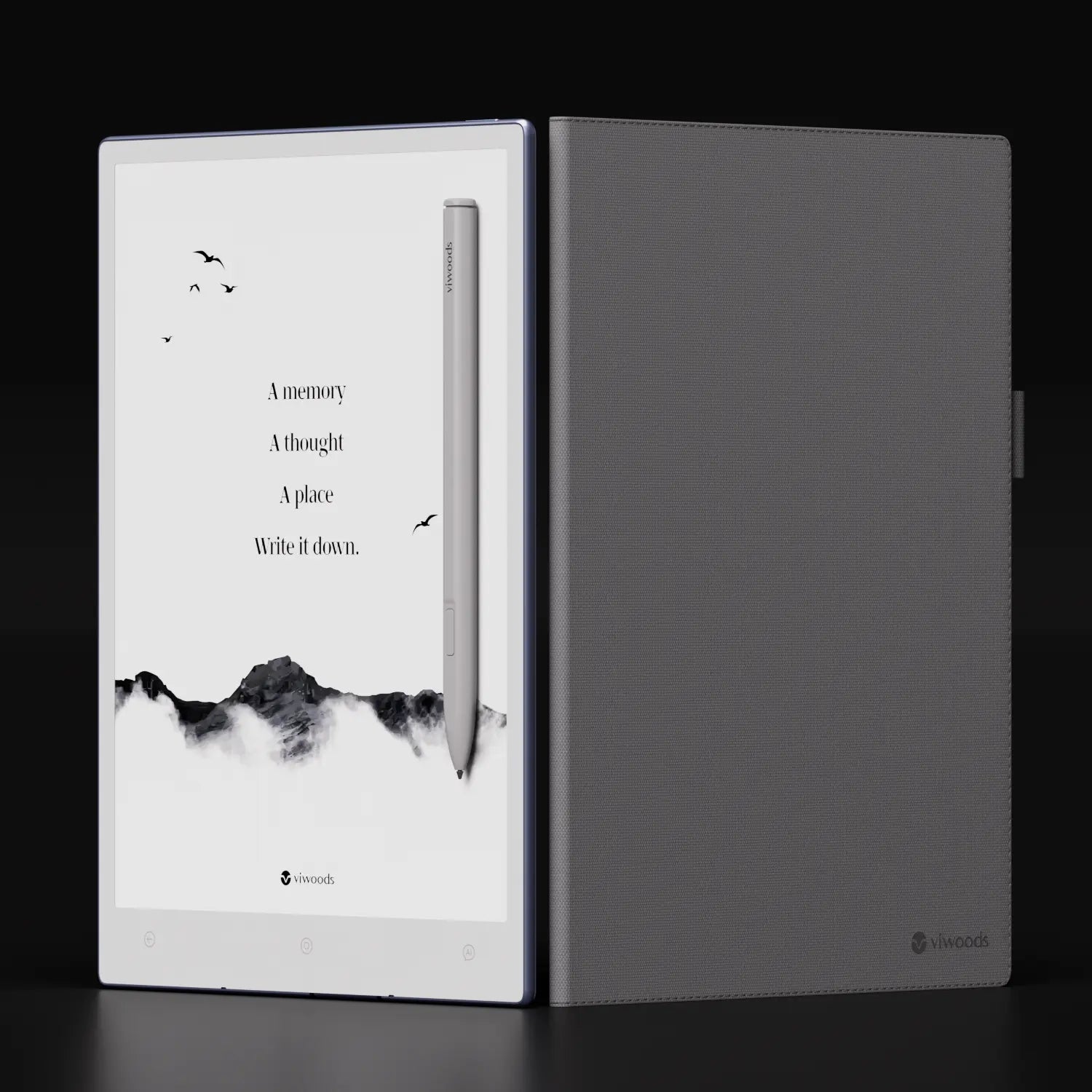
AiPaper: 300 PPI For Notes And Documents
On AiPaper, 300 ppi serves both handwriting and reading. Everyday writing, quick annotations, and simple diagrams stay clear at your normal handwriting size, so you don't need to inflate your script to keep it legible. When you open PDFs or longer documents, small text and thin lines remain defined at practical zoom levels, which keeps notebook pages and reference material visually in step.
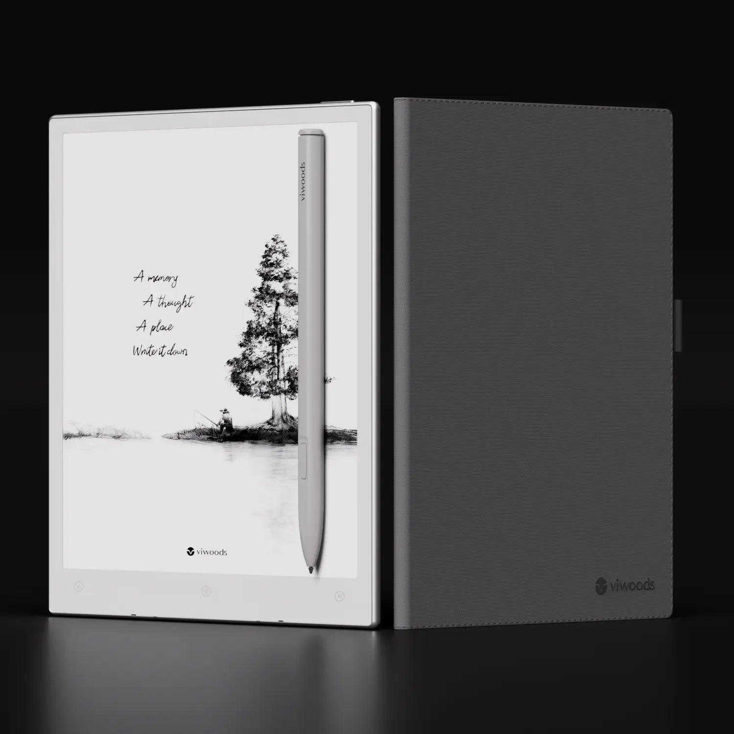
AiPaper Reader: 300 PPI For Focused Reading
AiPaper Reader uses the same 300 ppi resolution with a reading-only design. Body text in books and articles looks settled at comfortable sizes, and smaller elements such as notes or reference lines remain clear alongside the main text. For long black and white reading sessions, that density mainly helps the page feel calm, consistent, and easy to follow.
FAQ:
Q1: Is 300 PPI good for an E Ink reader?
Yes. For most people, 300 ppi is a strong level where text stops looking blocky and starts feeling naturally readable, allowing you to choose fonts and sizes you like instead of compensating for a lower-detail display.
Q2: Does 300 PPI E Ink make small text easier to read?
In general, yes. Because more pixels describe each character, smaller fonts hold their shape better than on lower-density panels, which often means you can read modestly smaller text before you feel the need to zoom.
Q3: Will 300 PPI E Ink improve my handwriting experience?
It improves how your handwriting looks, not how the pen feels. Higher pixel density lets the E Ink screen render curves, loops, and small characters with finer steps, so your usual handwriting style tends to stay clearer and more recognisable on the page.
Q4: Does 300 PPI cause more eye strain?
Not by itself. Eye strain is influenced more by lighting, font size, contrast, and your overall screen time, while 300 ppi usually helps by making edges cleaner and text easier to parse at a glance.
Q5: What's the difference between 300 PPI and 300 DPI?
PPI (pixels per inch) describes how many pixels a screen shows in each inch, so it's a measure of display resolution. DPI (dots per inch) comes from printing and describes how many physical dots a device can place on paper. The two ideas are related, but PPI is used for screens and DPI is used for printed output, so they are not interchangeable.

Putting 300 PPI In Perspective
In the end, 300 ppi is more about how steady the page feels when you actually read and write on E Ink. At this density, text, diagrams, and handwriting have enough detail to stay clear without constant tweaking, while contrast, lighting, fonts, and device design do the rest of the work around that foundation. If you treat 300 ppi as a baseline for modern E Ink, it becomes much easier to compare devices, because you can focus on which one matches the way you read, take notes, and move through your day.
Guides Paper Tablet
Digital Notepad for Daily Planning and Quick Notes
Viwoods AI Paper V3.14 update
Digital Notebook Buying Guide for Work and Study
Writing Tablet for Professionals: What to Check
Note Taking Tablet for College Students: What Matters
E Ink Tablet for Work: A Calm Setup for Notes and PDFs
Digital Notebook vs Paper Notebook: Which Helps You Think Better?
Best Paper Tablet in 2026: Complete Buying Guide and Top Picks
Best Paper Tablet for Lawyers (2026) | AI Digital Notepad with PDF Annotation
E Ink Tablet Basics: Essential Insights to Get Oriented
Viwoods AiPaper
$469.00
Viwoods AiPaper Mini
$389.00
Viwoods AiPaper Reader
$279.00

Viwoods W1 Stylus
$39.00