
You know that moment when a grayscale chart or map on your ereader feels like it's hiding half the story, and you end up reaching for your laptop to see the colors properly? AiPaper Reader C is built for exactly that gap: a compact color ereader that keeps the calm, paper-like feel of E Ink while adding just enough color to make charts, diagrams, textbooks, and comics actually make sense at a glance.
Built on the same AI reading workflow as AiPaper Reader and powered by an E Ink Kaleido 3 display, it pairs sharp 300 PPI black-and-white text with color that's there to clarify, not distract, plus a front light you can tune from cold to warm so late-night reading or early-morning prep still feels comfortable.

Meet AiPaper Reader C: Color for Close Reading
Built on the AiPaper Reader foundation
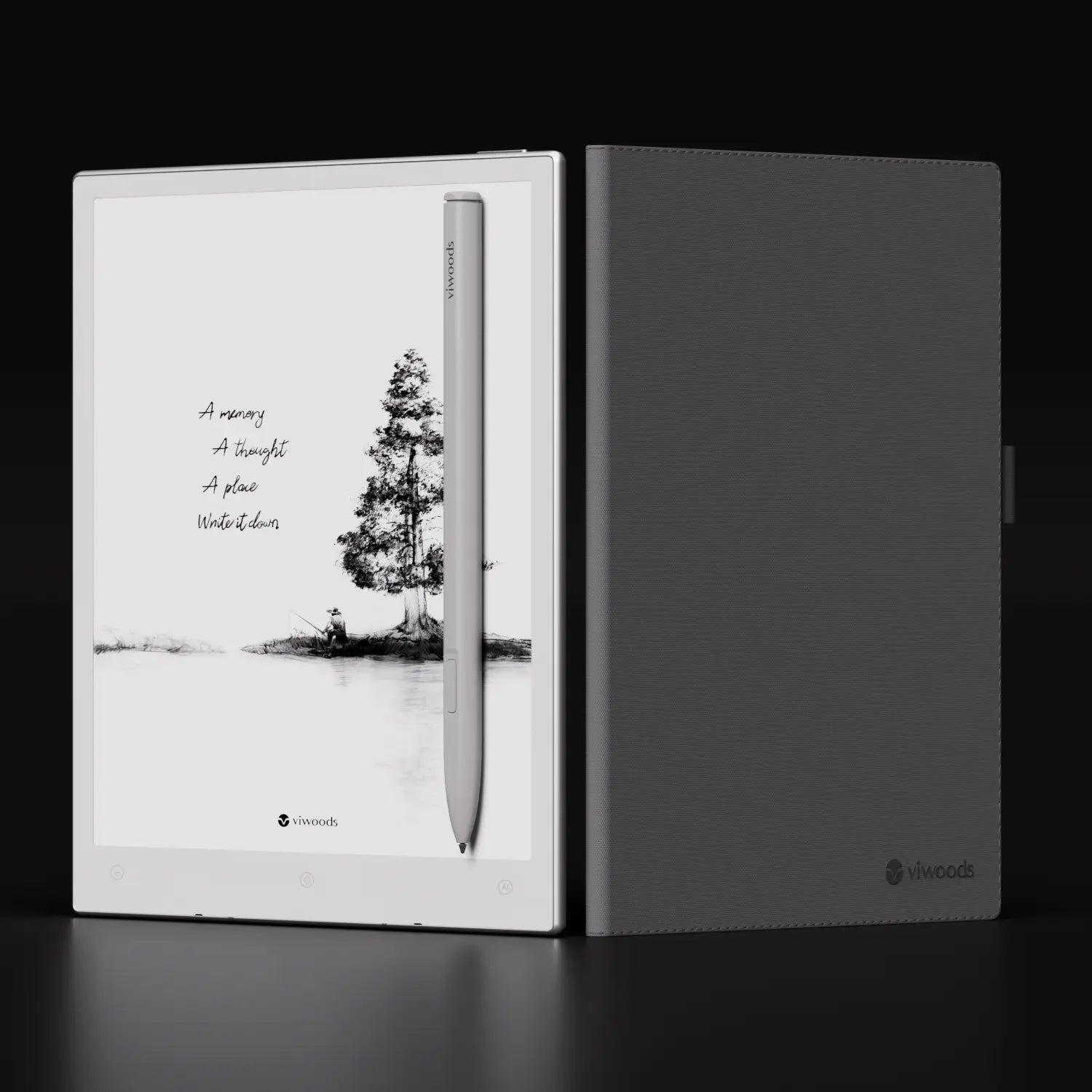
AiPaper Reader C keeps the same basic layout and logic as AiPaper Reader. It's a compact E Ink device with Android, page-turn buttons, an AI Key for quick voice questions, screenshot capture so you can send a passage or figure to AI, and a Knowledge Base where you can store the answers you want to revisit. If you already know how to move through pages, call up AI and review saved notes on AiPaper Reader, you can pick up AiPaper Reader C and use it in the same way from day one.
Who AiPaper Reader C is for
This is the color ereader you choose when part of your day depends on visual cues. If you often read reports with colored lines, maps that separate regions by shade, diagrams that code steps by hue, or comics and illustrated books that lose something in grey, AiPaper Reader C gives those pages enough color to stay clear while still feeling like a focused reading device.
How Kaleido 3 Display Works on AiPaper Reader C
Grayscale core with a color layer
At the base, AiPaper Reader C still uses a black and white E Ink screen that arranges light and dark particles into the letters and lines you read for detail, then a thin E Ink Kaleido 3 layer sits on top and adds a controlled grid of color filters so this color e ink reader can show selected areas in color while keeping the reflective, paper like look.
What 300 PPI text and 150 PPI color mean in practice
The grayscale layer runs at 300 pixels per inch, which keeps body text, captions, and fine rules clean enough for close reading, while color information is arranged at an effective 150 pixels per inch, which is lower in absolute sharpness but still clear for bands in charts, regions on maps, blocks in diagrams, and simple icons.
What 4096 colors mean on the page
The Kaleido system can render up to 4096 colors, which gives enough range for the tones you expect in reports, learning material, and illustrated pages, so each line in a graph can keep its own hue, adjacent areas on a map do not blend into one another, and callouts or panels stand out without looking harsh.

Color in Context: When Pages Depend on It
Charts and data that stop blending
In a grayscale view, several lines or bars in one chart can collapse into similar grey, and you end up spending attention just working out which series is which instead of thinking about what the numbers actually say. On an ereader in color, each line and segment keeps its own tone, so following one trend across a dense graph and comparing it with another becomes a straightforward reading task instead of a guessing game.
Maps and diagrams that are clear at a glance
Maps, transit layouts, and system diagrams often reuse the same shapes and change only the color to mark routes, regions, or layers, which makes the layout much harder to read once everything is flattened to grey. When those hues remain distinct, a quick look is enough to see where one line runs, how two areas differ, or which part of a diagram deserves your focus, which is exactly the kind of fast checking you tend to do on a compact reader.
Textbooks and manuals that use color to teach
Many textbooks, handbooks, and training guides rely on color-coded examples, warnings, and status markers, and that extra layer of structure disappears as soon as the page loses its palette. Keeping those colors visible means you can scan for highlighted steps, spot caution boxes, and separate reference notes from the main text much faster, which makes it easier to navigate process-heavy material on a small screen.
Comics and illustrated reading that keep their tone
Comics, graphic essays, and illustrated nonfiction lean on color to set mood and emphasis, so when every panel falls into grey, it becomes harder to feel pacing or see which element should catch your eye first. When scenes, speech bubbles, and emphasis panels keep their intended tones, the page reads closer to print, and you can still pause, reflect, or call on AI for context without feeling that part of the story has been stripped away.

Read With AI, Now in Color Context
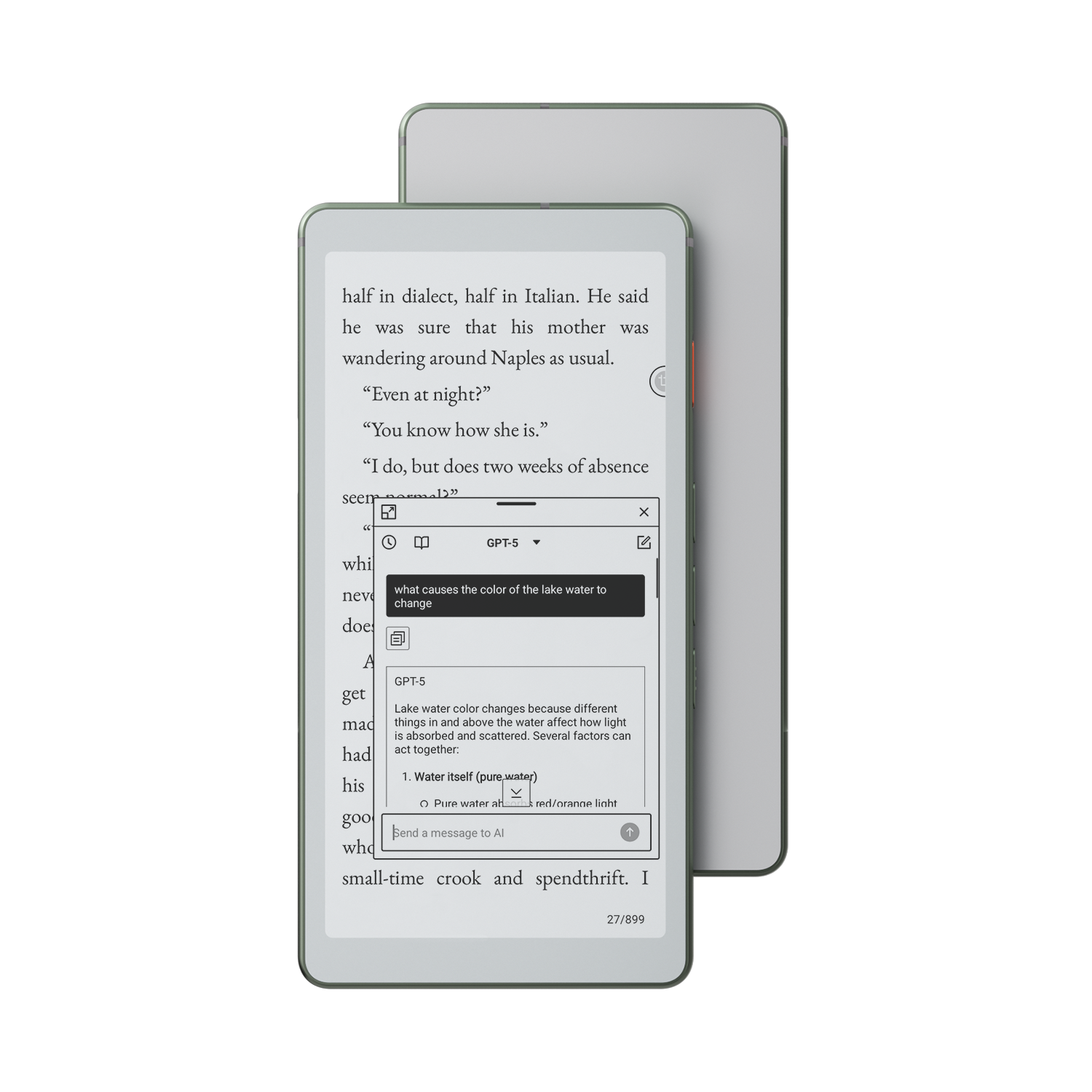
Ask AI about the part that matters
When a chart or map uses several colors to tell one story, you press the AI Key and point your question at the specific element you care about, so you can say "explain the red curve" or "summarise the blue route" and get an answer tied to that part of the page.
Capture colored charts and diagrams for focused help
If a figure is dense, you frame just that area with the capture tool and send it to AI, so the system works on the cropped chart, map, or process diagram. That makes it easier to ask for a plain language explanation, a comparison between two colored regions, or a short list of steps that follow the flow in the diagram.
Save explanations from complex pages into Knowledge Base
When an answer finally makes a tricky figure clear, you can save that exchange into the Knowledge Base together with the prompt and a link back to the source page. Over time, this builds a small library of explanations for specific charts, maps, and layouts that you can reopen before a meeting, exam, or review session, so the work you do once on an ereader in color stays useful long after you close that document.
Read Anywhere: Pocket Hardware, Adjustable Front Light
Pocket-sized, made for one hand
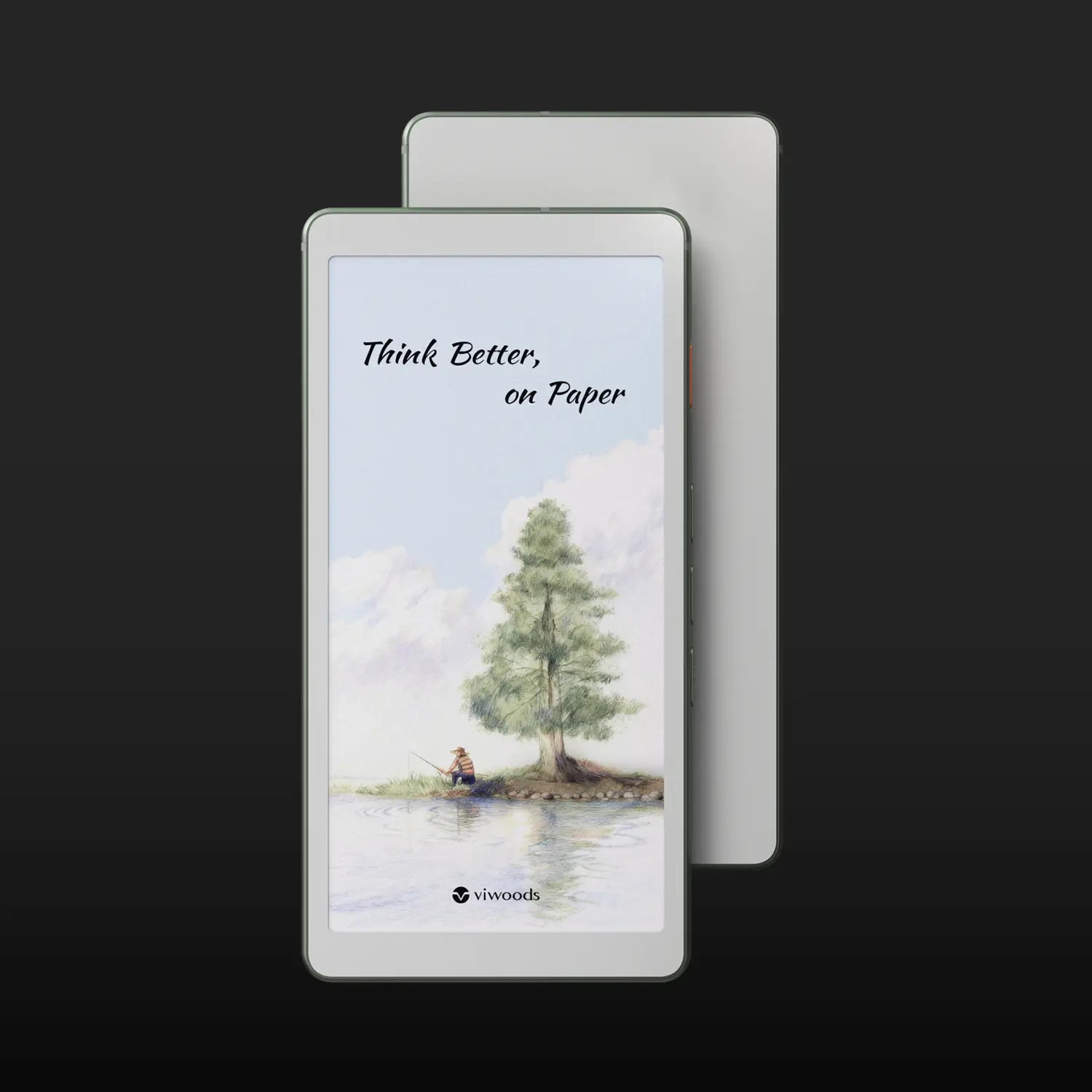
AiPaper Reader C features a 6.13-inch E Ink screen in a slim body that slips easily into a jacket pocket or small bag and sits comfortably in one hand. The light frame and side page buttons let you maintain a steady grip while reading on the train, in a queue, or on the sofa, which is how a 6 inch color ereader earns a place in your everyday carry.
Front light that matches the room
The front light lets you adjust both brightness and color temperature, so you can keep the page cool and clear during the day or shift it to a warmer glow at night when reading beside a lamp. Because the light is cast from the front and spreads evenly across the E Ink surface, you can increase it enough to see smaller text or detailed figures while the screen still feels gentle on your eyes.
Powered by Android 16
With Android 16, the interface feels familiar, and you can sign in to the services you already use for books, articles, and documents. Your reading apps, cloud drives, and note tools stay in one place, with Wi-Fi handling online updates and Bluetooth taking care of wireless accessories, so this Kaleido 3 ereader works as a small, focused extension of your everyday workspace.

AiPaper Reader vs AiPaper Reader C: Monochrome or Color?
Consider this a brief preference test. For each line, decide if your honest answer is Yes or No.
1. I am happy if most of my reading looks like a printed black and white page.
Yes → Monochrome
No → Color
2. When a page designed in color turns grey, I feel that part of the meaning is lost.
Yes → Color
No → Monochrome
3. I care more about a very calm, simple page than about matching the original layout exactly.
Yes → Monochrome
No → Color
4. I find it easier to understand or remember content when key parts are marked in different colors.
Yes → Color
No → Monochrome
5. If I printed my usual documents, I would choose black and white printing almost every time.
Yes → Monochrome
No → Color
How to read your answers
If "Color" appears more often, your reading habits lean toward pages where color plays a real role, so AiPaper Reader C is the better fit.
If "Monochrome" wins, your pages are mostly text focused and look fine without color, which means the AiPaper Reader is likely the better match.
AiPaper Reader C: Color in Its Right Place
AiPaper Reader C brings the whole story together as a color ereader that treats color as part of reading, combining a Kaleido 3 color screen, adjustable cold–warm front light, and on-page AI into one compact device where you can move from dense charts to paragraphs to saved explanations without leaving the calm feel of E Ink. If you want a reader that keeps your focus on the page while quietly restoring the color cues and AI support you've seen throughout this article, AiPaper Reader C is the point where your screen finally matches the way you already read.
Guides eReader
What Is the Best eReader for Students in 2026?
Color eReader: A Practical Overview of Color E Ink Today
How to Read Manga on eReaders: Guide for a Smooth Experience
AI Knowledge Base: Turn Reading Insights into Reusable Notes
Android eReader: Flexibility Meets Your Reading Routine
Kaleido 3: Color E Ink That Still Feels Like Paper
AiPaper Reader C: Kaleido 3 Color, Focused Daily Reading
AI Button on Viwoods AiPaper Reader: Tap for On-Page Answers
eReader Decision Path: Screen Clarity, Apps, AI, Pocket Fit

Viwoods AiPaper
$549.00
Viwoods AiPaper Mini
$429.00
Viwoods AiPaper Reader Colour
$349.00
Viwoods AiPaper Reader
$279.00