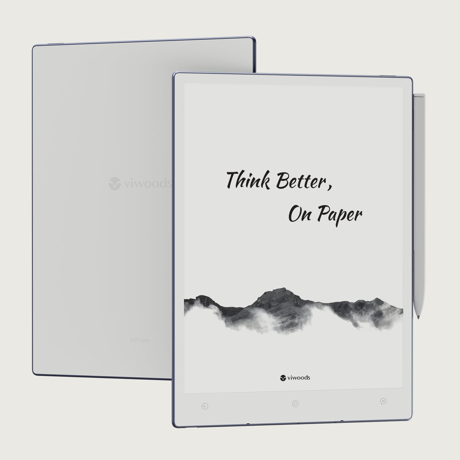
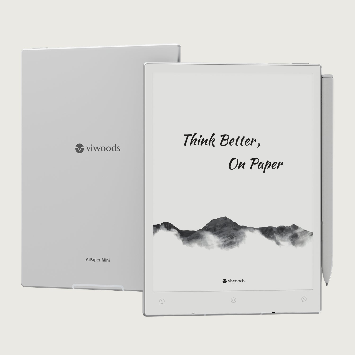
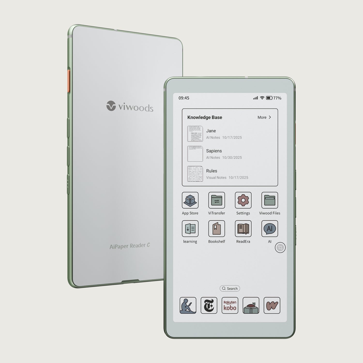
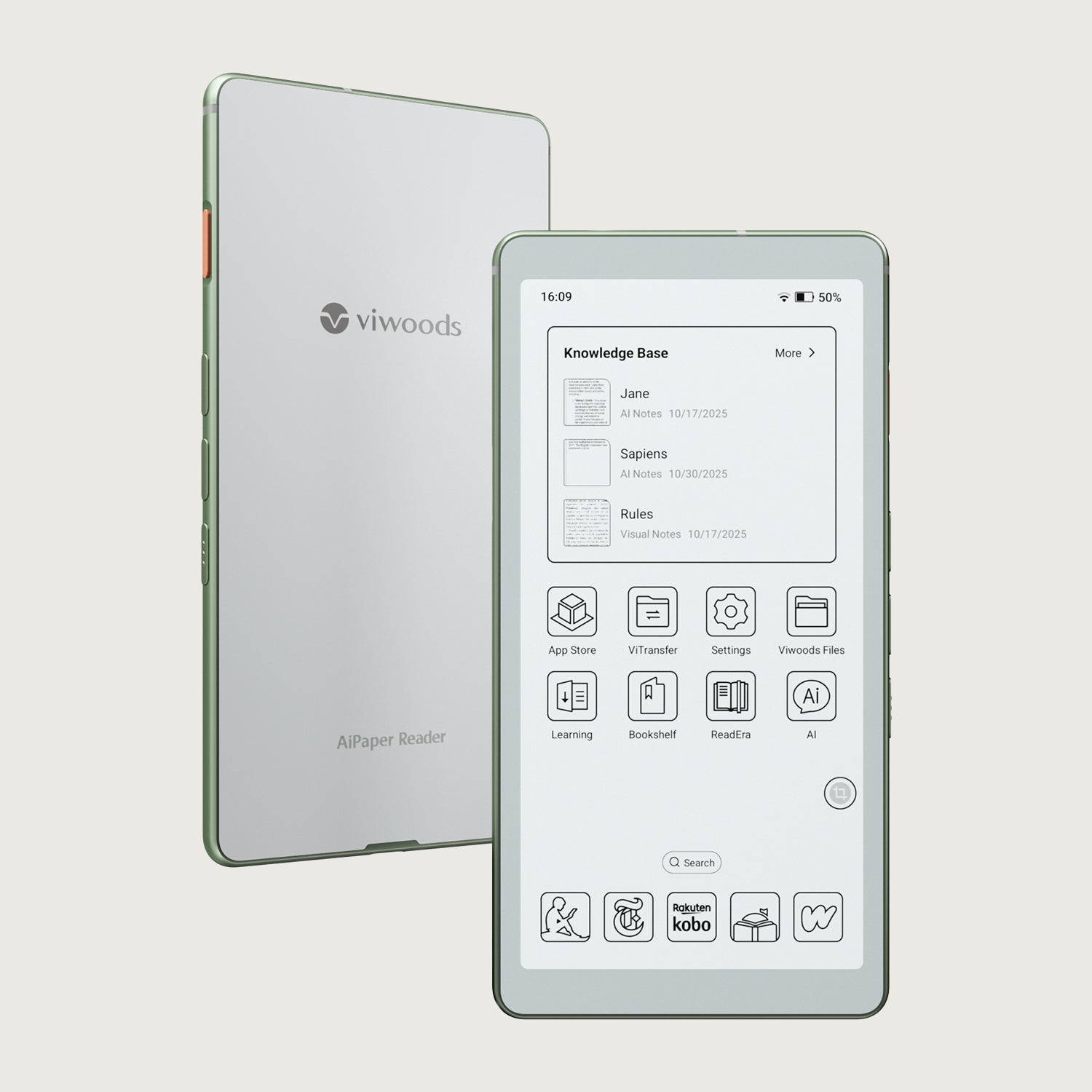
Compare AiPaper Reader and Reader Color for text reading, visual pages, AI reading support, Android apps, and everyday Viwoods eReader selection.
AiPaper Reader vs Reader Color is mainly a display decision. Choose the monochrome AiPaper Reader when books, essays, reports, and text-heavy files make up most of your week. Choose AiPaper Reader C when charts, maps, diagrams, comics, covers, screenshots, or color-coded study material regularly lose meaning in grayscale.
“Reader Color” is used here as the comparison phrase; the official product name is AiPaper Reader C. Both models are compact Android eReaders with AI reading support, so the useful question is not which one has more software. It is which screen removes more friction from the pages you actually open.
Start with daily content
AiPaper Reader vs Reader Color: The Fastest Way to Decide
Do not start with the longer feature list. Start with the last seven days of reading. Look at the books, PDFs, web pages, study notes, charts, maps, comics, and app screens you actually used. The model that preserves those pages with the least compromise is the better choice.
The monochrome Reader is not the “basic” option, and Reader C is not automatically the “better” option. Monochrome gives text a cleaner, more direct presentation. Color keeps visual labels and page structure intact. Each solves a different reading problem.
Choose AiPaper Reader
When words carry the page
Best for novels, essays, newsletters, reports, long articles, language reading, and documents whose meaning survives perfectly in black and white.
- You prefer the clearest possible text-first page.
- Color is rare or decorative in your files.
- You mainly read in one-column book or article layouts.
Choose AiPaper Reader C
When color carries information
Best for charts, diagrams, maps, textbooks, comics, illustrated articles, app libraries, and documents that use color to separate categories or guide attention.
- Grayscale often makes your files slower to understand.
- You identify content by covers, icons, or color-coded sections.
- Your reading moves between prose and visual reference pages.
A reliable rule: choose Reader C only when color changes comprehension, recognition, or navigation often enough to matter. Choose AiPaper Reader when color is mostly optional and text clarity is the priority.
What changes on the page
Monochrome Carta 1300 vs Kaleido 3 Color
AiPaper Reader uses a Carta 1300 monochrome E Ink display. AiPaper Reader C adds a Kaleido 3 color layer, combining sharp black-and-white text with softer color for diagrams, maps, covers, interface elements, and illustrated pages. Both remain reflective E Ink screens rather than glossy tablet displays.
That distinction sets the correct expectation. Reader C does not try to reproduce the saturation or motion of an LCD or OLED panel. Its value is practical color: enough separation to tell one chart line from another, recognize a map region, follow a textbook diagram, or preserve the mood and hierarchy of an illustrated page.
Because the software foundation is closely related, the display should remain the tie-breaker. AI access, Android apps, file management, and connectivity are useful on both. They do not make Reader C the right choice for a text-only library, and they do not make monochrome the right choice for color-dependent documents.
Text-first reading
Where AiPaper Reader Has the Clearer Advantage
Monochrome makes the strongest case when a reading session depends on paragraphs, headings, footnotes, definitions, and page flow. Novels, essays, biographies, professional reports, policy documents, and long saved articles usually do not need color to preserve meaning. A clean black-and-white display keeps attention on wording and structure.
This matters most during long sessions. When the page is mostly prose, color can become unused capability rather than a daily benefit. Readers who move through chapter after chapter may value the visual directness of monochrome more than occasional color elsewhere in the library.

A focused choice for books, essays, and reports
AiPaper Reader is the better fit when text carries nearly all the value and color rarely changes how the page is understood.
View AiPaper ReaderStrong use cases for the monochrome model
Long booksFiction, biography, history, business, philosophy, and other prose-led titles where a stable page matters more than visual color.
Work readingBriefs, contracts, reports, meeting documents, and policy material built mainly from text, headings, and simple tables.
Saved articlesNewsletters, essays, web articles, and read-it-later queues where images are secondary to the written argument.
Language readingClose reading that benefits from quick translation, definitions, explanation, and text review without needing a colorful page.
A monochrome page can also make library decisions simpler. When most covers, highlights, and interface elements are secondary, the reader spends less time judging presentation and more time moving through content. That is not a universal productivity claim; it is simply a better fit for people whose reading habit is already text-led.
The limitation appears when the file was designed around color. Two graph lines may become difficult to separate. A map legend may lose its visual shortcut. A diagram may rely on colored stages or labels. AiPaper Reader remains usable for those pages, but the reader may need more zooming, more cross-checking, or another screen to recover the missing context.
Color with a purpose
Where AiPaper Reader C Becomes the Better Tool
Reader C is most useful when color is part of the information architecture. A colored chart is not merely prettier when each line represents a different data series. A map is not merely decorative when regions are separated by shade. A textbook diagram is not merely illustrated when colors group related parts or show a process.
The same logic applies to comics and graphic stories. Panel composition still works in grayscale, but color may carry atmosphere, time of day, character recognition, or emphasis. Readers who regularly buy or borrow color titles should judge the page as a complete visual object rather than treating color as an optional extra.

A stronger fit for charts, maps, diagrams, and illustrated reading
Choose Reader C when color repeatedly helps you identify sections, follow visual relationships, or understand the page without reopening it elsewhere.
View AiPaper Reader CColor adds real value in five situations
- Charts with multiple series: colors make lines, bars, categories, and callouts easier to separate without repeatedly checking labels.
- Maps and geographic pages: shaded areas, routes, elevation zones, and legend categories retain their intended grouping.
- Illustrated study material: anatomy, science, language cards, design references, and step-by-step diagrams can preserve more of their original teaching structure.
- Comics and graphic books: color keeps more of the original pacing, mood, character cues, and panel emphasis.
- Mixed app libraries: covers, icons, screenshots, and saved-page previews remain easier to recognize during browsing.
Set the right color expectation
Kaleido 3 color is softer and more paper-like than a conventional tablet screen. That is appropriate for reading, but it is not the right purchase for someone expecting bright video, fast animation, or glossy photo reproduction. Reader C should be bought for informative color on calm pages.
The format test
PDF Reading: Color Is Not the Only Question
Both Readers use a compact 6.13-inch format. That makes them easy to carry, but it also means page layout matters. A reflowable EPUB can adapt its font size and margins. A fixed-layout PDF keeps the original page dimensions, columns, labels, and image placement. On a small screen, a dense A4 or Letter-size PDF may require zooming or landscape view regardless of whether the display is monochrome or color.
This is where many buying guides oversimplify the choice. Reader C may preserve the colors in a complex PDF, yet color alone does not make tiny multi-column text easier to read. AiPaper Reader may present black text very clearly, yet a full-page document can still feel crowded. The buyer should separate two questions:
- Does the document need color to preserve meaning?
- Does the document layout fit a compact screen without constant zooming?
For single-column reports, meeting notes, articles exported as PDF, manuals with moderate text sizes, and short reference documents, either model can make sense. Choose by color dependence. For academic papers with two columns, engineering drawings, spreadsheets, full-page magazines, or detailed forms, test the actual file before assuming a pocket Reader will replace a larger device.
Good compact-screen PDF candidates
- Single-column reports and briefs
- Article exports with readable body text
- Simple manuals and meeting documents
- Reference pages opened for short checks
Files to test before buying
- Two-column research papers
- Large spreadsheets and dashboards
- Detailed engineering or design drawings
- Full-page magazines with small captions
A practical purchase test is to gather three representative PDFs: one easy file, one normal file, and one difficult file. Check whether they rely on color, whether the text remains comfortable at the expected zoom level, and whether page navigation feels acceptable. That test is more useful than choosing from the word “PDF” alone.
Reading environment
Front Light and Where You Read
Display choice is usually the main decision, but lighting control can matter for readers who use the device at night. AiPaper Reader offers adjustable brightness with a cool-toned front light. AiPaper Reader C adds warm and cool tone adjustment, giving the reader more control over the page appearance in different rooms and at different times of day.
That does not automatically make Reader C the better night reader. A reader who mainly wants crisp monochrome text may still prefer AiPaper Reader. The warm-light option becomes relevant when tone control is part of the evening routine rather than an occasional setting.
Think through the real environments:
Daylight and commutingPrioritize fast page access, physical grip, and whether your content needs color.
Dim roomsCheck whether brightness adjustment alone is enough or whether warm-tone control matters.
Before sleepChoose the page and light behavior that you are most likely to use consistently.
Short reference checksColor recognition may matter more than tone control when charts or maps are opened briefly.
Page movement and app feel
Refresh Modes Matter More Than Many Buyers Expect
E Ink handles a static page differently from a phone or tablet. A book page, article, or document can look calm and clear, while fast scrolling, animated menus, video previews, and constantly changing interfaces may show more delay or visual residue. Both Reader models provide refresh choices so the user can balance page clarity against faster interaction, but the best mode still depends on the app and the task.
For normal books, use a clarity-focused mode and turn pages deliberately. For a web article or app menu, a faster mode may make navigation easier. For charts, maps, or color pages on Reader C, switching between color and grayscale-oriented viewing options can help match the screen to the content. The important point is that one refresh setting will not be ideal for every page.
This is also why app compatibility should be judged by behavior rather than installation alone. An app can install successfully but still feel awkward if it relies on continuous scrolling, small animated controls, or gesture-heavy navigation. A simpler app with page-based movement may feel better even when it offers fewer decorative features.
Books and EPUBsPrioritize clean text and page turns. Animation matters very little.
PDF navigationZooming, panning, and page fit matter. Test a dense file rather than an easy sample.
Web and article appsLook for page-based reading modes or simplified views that reduce constant scrolling.
Library browsingReader C can make covers and icons easier to identify, while monochrome keeps the interface visually simpler.
Know when the category is wrong
When Neither Reader Is the Complete Answer
A trustworthy comparison should also identify the situations where choosing between monochrome and color does not solve the main problem. Both products are compact reading devices. Their portability is a strength, but it sets a natural boundary around tasks that need a large canvas, fast motion, precise color reproduction, or extensive editing.
Consider another device category, or keep a second device in the workflow, when the primary task is one of the following:
- Full-page professional PDFs all day: architectural drawings, dense academic papers, spreadsheets, and complex forms may benefit more from a larger display than from changing display color.
- Color-critical work: photo editing, brand color approval, design proofing, and any task that depends on exact saturation or color accuracy belong on a calibrated conventional screen.
- Video and animation: E Ink is built around stable pages, not fast entertainment or motion-heavy interfaces.
- Large-scale handwriting or diagram creation: readers who mainly want a digital notebook, broad canvas, or detailed markup may need a larger writing-focused E Ink tablet.
- Desktop-style multitasking: simultaneous windows, complex spreadsheet editing, and rapid switching between production apps are not the core purpose of a pocket Reader.
This does not make either product inadequate. It keeps the purchase aligned with the category. AiPaper Reader and Reader C are strongest when the main job is reading, light reference, file access, and focused AI-assisted understanding in a compact format.
Shared platform
AI and Android Are Shared Strengths, Not the Tie-Breaker
Both models run Android 16 and are designed around app-based reading, local file management, cloud access, 4G connectivity, and an AI button. That means readers can build a workflow around book apps, library services, read-it-later tools, PDF apps, cloud folders, dictionaries, and light web reference instead of staying inside one closed content store.
Android flexibility is valuable when a library is spread across services. It also creates setup work. App interfaces designed for phones may depend on fast scrolling, animation, or dense menus that do not translate perfectly to E Ink. The correct question is not “Does it run Android?” but “Do the specific apps I rely on work acceptably for the tasks I perform?”

Build the app workflow before choosing the screen
List the services, file types, cloud folders, and reading apps you use. Then choose monochrome or color according to how those pages need to look.
Compare Viwoods eReadersA focused Android setup
A practical setup is usually smaller than an app drawer full of possibilities. One primary book app, one read-it-later app, one PDF or file tool, one cloud service, and one dictionary or language tool cover many routines. Extra apps should earn their place by solving a recurring reading problem.
For deeper background on app choice and compatibility, the Android eReader guide explains where open app access helps and where E Ink app behavior can create friction.
Use AI to support reading, not replace it
The AI button can support quick questions, on-page explanation, translation, comparison, and review while the source page remains visible. This is especially useful when the alternative is leaving the reader, opening another device, copying text, and losing the original reading position.
AI output should still be checked against the source, especially for technical, legal, medical, academic, or numerical material. A short explanation can make a difficult passage easier to approach, but it should not be treated as a guarantee that the source has been interpreted perfectly.
The Viwoods AI Button guide is the more appropriate page for a detailed explanation of the AI workflow. In this comparison, AI is a shared capability. The deciding factor remains whether the source page should stay monochrome or retain color.
Match the reader
Which Model Fits Each Type of Reader?
The most useful recommendation comes from a full reading pattern rather than one isolated feature. These profiles show where each model normally earns its place.
Profile 1
The long-form book reader
Most sessions are novels, nonfiction, essays, and saved articles. Images are occasional and rarely essential.
Better fit: AiPaper Reader. The monochrome display directly serves the content that appears every day.
Profile 2
The visual learner
Study materials include charts, anatomy images, maps, color-coded examples, diagrams, and illustrated explanations.
Better fit: AiPaper Reader C. Color is part of the learning structure, not decoration.
Profile 3
The comic and illustrated-book reader
A meaningful share of the library depends on color panels, visual mood, covers, and illustration detail.
Better fit: AiPaper Reader C. It preserves more of the intended visual experience.
Profile 4
The report and article reader
Most work is prose, but occasional charts and dashboards appear in meetings or research.
Better fit: depends on frequency. Choose Reader C when those visuals appear weekly and affect decisions; choose monochrome when they are rare.
Profile 5
The mixed-app reader
Books, library loans, saved web pages, cloud PDFs, and reference apps all share the same device.
Better fit: choose by page mix. Android flexibility is shared; display needs break the tie.
Profile 6
The large-PDF professional
The main files are full-page plans, spreadsheets, academic papers, or dense technical documents.
Buying advice: test first. Screen size may matter more than color; do not purchase from the display label alone.
A practical decision method
Use a Seven-Day Reading Audit Before You Buy
Instead of imagining an ideal future library, audit the one you already use. For seven days, record the page types you open and whether color changes the task. The process takes only a few notes and gives a more honest answer than comparing feature labels.
- List each reading session. Mark it as book, article, PDF, comic, map, chart, textbook, app library, or other.
- Mark color as essential, helpful, or unnecessary. Essential means meaning is lost; helpful means navigation improves; unnecessary means the page works the same in grayscale.
- Note the layout. Reflowable text, single-column PDF, two-column PDF, full-page visual, or app interface.
- Record where you read. Daylight, commute, office, dim room, or before sleep.
- Count repeated needs. Buy for patterns that appear every week, not one file you may open twice a year.
If essential or helpful color appears in a meaningful share of normal sessions, Reader C has a clear job. If nearly every page works perfectly in grayscale and most sessions are long-form text, AiPaper Reader is the more direct purchase.
Before checkout
Five Checks That Prevent the Wrong eReader Choice
A good comparison should end with actions, not another summary. Before ordering either model, verify the following against your real files and services.
1. Check your essential apps
List the exact book, library, article, cloud, PDF, dictionary, and note apps you need. Confirm login method, file access, page-turn behavior, and whether the interface is practical on E Ink.
2. Test representative files
Use real EPUBs, PDFs, comics, charts, and documents. A product image cannot show whether your smallest labels, columns, or page margins will feel comfortable.
3. Decide whether color is essential
Do not count every cover or icon. Count pages where grayscale makes reading slower, hides categories, or forces you to reopen the file on another screen.
4. Review your lighting routine
Choose based on how often you read in dim rooms and whether warm–cool tone adjustment is a real preference rather than a feature you may never change.
5. Confirm current order details
Check the official product page for current availability, regional shipping information, included items, return terms, warranty details, and any country-specific charges before payment.
Need help with an unusual workflow?
Ask about the exact app, file format, language, cloud service, or reading scenario instead of asking which model is “best” in general.
Contact ViwoodsFinal recommendation
Choose AiPaper Reader when your normal week is dominated by prose and plain documents. Choose AiPaper Reader C when visual pages appear often enough that color improves understanding or navigation. When the main files are dense full-page PDFs, test screen fit before letting the color question decide.
View eReader Collection Ask About Your Reading SetupCommon buying questions
FAQ
Is AiPaper Reader C better simply because it has color?
No. Reader C is better when color repeatedly preserves useful information or makes a mixed visual library easier to navigate. AiPaper Reader can be the better purchase for readers who spend most of their time in books, essays, reports, and plain documents because the screen is dedicated to monochrome text.
Which model is better for PDFs?
It depends on the PDF. Choose Reader C when color-coded charts, maps, or diagrams matter. Choose AiPaper Reader for text-led PDFs that work well in grayscale. For dense A4, Letter-size, multi-column, spreadsheet, or drawing-heavy files, test the compact screen layout before deciding because zoom and page fit may matter more than display color.
Does Reader C look like a normal tablet?
No. Kaleido 3 color is softer and more print-like than an LCD or OLED screen. It is designed to preserve useful color on an E Ink reading surface, not to deliver glossy photos, fast animation, or vivid video.
Do both models support Android apps and AI reading?
Yes. Both are built around Android 16, app-based reading, file management, cloud access, 4G connectivity, and an AI button. App compatibility and E Ink interface behavior can vary, so buyers should check their essential apps rather than treating Android support as a guarantee that every phone-style interface will feel ideal.
Which model is better for reading at night?
Both provide front-light control. AiPaper Reader uses adjustable brightness with a cool-toned front light, while Reader C adds warm and cool tone adjustment. Choose according to the screen you prefer for your content first, then decide whether adjustable color temperature is important in your evening routine.
What should I send Viwoods support before asking for a recommendation?
Provide the exact apps you use, two or three representative file types, whether color is essential, the languages you read, and whether the main documents are reflowable books or fixed-layout PDFs. A specific workflow question is more useful than asking which device is best for everyone.
Choose from real reading habits
Compare the pages you read, then compare the products
AiPaper Reader is the direct choice for a text-heavy library. AiPaper Reader C is the practical choice when color repeatedly preserves meaning in charts, maps, diagrams, comics, and illustrated pages. Review your apps and representative files, check current order details on the official pages, and ask support about any workflow that does not fit a simple category.
View AiPaper Reader View AiPaper Reader C Contact Viwoods