
A practical guide to choosing an E Ink paper tablet case by checking exact device fit, screen coverage, corner protection, closure, stylus retention, and everyday handling.
Choosing an E Ink tablet case is less about finding the most impressive cover and more about making everyday handling feel uneventful. A case earns its place when the tablet can move from a desk to a meeting room, sit beside a laptop, open for a quick handwritten note, and close again without creating another thing to think about. Exact device fit comes first. Screen coverage, corner protection, closure, stylus retention, and carry bulk come next.
That order matters because cases that look almost identical can behave very differently once a tablet is actually inside them. A loose corner, awkward pen position, exposed edge, or cover that never sits naturally can become more noticeable than color or surface finish after a week of regular use. The goal is not maximum protection at any cost. Instead, the goal is enough protection around the places that face real daily risk, without making reading and handwriting unnecessarily awkward.
If you are still deciding whether your daily setup needs a case, sleeve, spare tips, or a backup stylus, use the paper tablet accessories checklist first. The narrower decision here begins once a case is needed: which compatible design protects the device without getting in the way of reading, writing, or carrying it?
THE PRACTICAL RULE
Match the exact device first. Then protect the screen, corners, closure, and stylus without making normal use harder.
Material and appearance can settle a final tie. They should not rescue a case that is already wrong for the device or the daily routine.
START WITH COMPATIBILITY
Confirm the Exact Device and Current Compatibility
A familiar scene explains why model matching matters. A tablet is placed into a new folio and everything looks correct from the front. Then one corner refuses to sit cleanly, the charging opening feels slightly off, or the side that should hold the stylus no longer lines up as expected. The case is close, but close is not the same as compatible.
Screen size alone cannot settle the question. Devices with similar display sizes can use different outer dimensions, corner shapes, frame profiles, button locations, or connector positions. Likewise, standard, Mini, Reader, and later model variations can look related while requiring different cases.
For that reason, the exact model name should eliminate unsuitable options before anything else receives attention. The current compatible protective cases collection separates case options by device family, making the model name a more useful starting point than a generic size description.
01 — MODEL
Read the full device name Family names and screen size alone are not enough.
02 — EDGES
Compare the physical outline Corners, sides, ports, and control areas should align naturally.
03 — CURRENT PAGE
Verify the active listing Old reviews and photos should not override current compatibility information.
Installation also provides a useful clue. A fitted case should feel deliberate rather than forced. The tablet should sit evenly, corners should not bow outward, and removal should not require aggressive bending around the device. If the first interaction already feels mechanically wrong, appearance becomes irrelevant.
PROTECT THE DISPLAY
Protect the Screen From Direct Contact and Pressure
A paper tablet often spends more time beside ordinary objects than near dramatic hazards. It sits next to notebooks, pens, charging cables, laptop edges, coffee cups, folders, and document stacks. During a busy day, those small contacts happen repeatedly. That is why useful screen protection starts with controlling what can touch the display when the tablet is not being written on.
A front cover creates separation, but the word “cover” alone says very little. The important question is what the closed surface actually looks like. A well-aligned folio should create a clean layer over the display. Hard clips, loose accessories, spare tips, or a stylus trapped inside that layer can defeat the purpose.
Pressure matters as much as scratches. A broad, even surface and a small hard object do not load the screen in the same way. As a practical habit, the inside of the closed case should remain predictable and free from loose objects. A case should reduce the number of accidental contacts, not create a new one.

Desk use and mobile use create slightly different concerns. At a desk, the cover prevents the display from becoming the surface on which other objects are casually placed. Between rooms, the same cover helps keep the screen separated from folders and nearby equipment.
None of this means a normal folio should be treated as crush protection. A front cover is useful for ordinary contact and routine handling, but protection from heavy compression should never be assumed unless a current product page states it clearly.
THE IMPACT ZONES
Check Corner and Edge Coverage
Corners often meet a hard surface before the center of a tablet does. A quick pickup from the edge of a desk, a rushed move between rooms, or an awkward set-down can turn one corner into the first contact point. As a result, corner coverage deserves its own check rather than being treated as part of the screen discussion.
Product images should make the retention structure visible. The case may use a fitted shell, raised corner sections, side rails, or another model-specific approach. The exact method matters less than the result: the tablet should stay seated during ordinary handling without requiring constant adjustment.
At the same time, more coverage is not automatically better. Charging areas, controls, speakers, microphones, or other openings may need clear access depending on the device. A useful case protects likely contact points while leaving normal interaction straightforward.
30-SECOND VISUAL TEST
- Check all four corners instead of judging one front-facing image.
- Look along both long edges for uneven gaps or exposed sections.
- Confirm that openings correspond to actual device controls or connectors.
- Imagine lifting the tablet from one side and watch for weak retention points.
- Consider whether a resting hand can make the device shift during handwriting.
This is where a case begins to feel either integrated or merely attached. Good protection usually becomes less noticeable during use because the tablet remains stable. Poor edge design keeps drawing attention back to the accessory.
CLOSED WHEN IT SHOULD BE
Evaluate Closure and Accidental Opening
Closure rarely feels important while a tablet is resting flat on a desk. It becomes more noticeable when the device is carried vertically, held under an arm for a short walk, or moved together with another notebook. At that moment, a front panel that stays where expected feels calm. One that swings or shifts becomes a recurring annoyance.
The case should also open without turning every short note into a setup routine. On a meeting-heavy day, a paper tablet may open for thirty seconds, close again, and reopen ten minutes later. Repeating that movement exposes small design weaknesses quickly.
Closure mechanisms should never be assumed from appearance alone. A folio may use magnetic alignment, a fitted edge, a strap, or another system. If a specific mechanism matters, the current product listing should state or clearly show it.
At the desk The cover should sit naturally instead of drifting across the display.
During a short carry The front panel should not demand constant hand pressure to stay controlled.
When reopening Access should remain quick enough for spontaneous notes and document checks.
The useful balance is predictable rather than dramatic. A cover should stay closed when protection matters and move out of the way when reading or writing begins.
KEEP THE WRITING TOOL WITH THE DEVICE
Decide How the Stylus Should Be Retained
Stylus storage seems like a minor accessory question until a note needs to be captured quickly and the pen is somewhere else. For a handwriting-centered paper tablet, that separation interrupts the most basic interaction: opening the page and writing immediately.
The preferred retention method depends on rhythm. Frequent handwriting favors a position that allows the pen to leave and return without effort. Longer reading sessions may place more value on keeping the stylus secure and out of the hand. Either way, storage should not press the pen against the display or interfere with closure.
Placement also changes the outside footprint. Side storage can make the full setup wider than the tablet body. A more enclosed position may keep the profile tidy but change the way the cover folds. Instead of treating the holder as a checkbox feature, it helps to imagine how often the pen moves in and out during a normal day.

Small accessories need the same logic. Spare tips are useful only when their storage keeps them away from the display and makes them easy to find later. Loose tips, clips, and adapters should not live between a folio cover and the screen.
In short, stylus retention works when it removes friction from writing without adding friction everywhere else. The best position is the one that feels almost automatic after the note ends.
PROTECTION VS. PORTABILITY
Balance Protection, Access and Carry Bulk
A paper tablet often feels appealing because it remains simpler to pick up than a laptop. A case should preserve as much of that feeling as possible. Once a cover becomes bulky enough that the device is repeatedly left behind, extra protection stops serving the actual routine.
The complete object matters more than the bare tablet specifications. The carried setup includes the front cover, rear structure, hinge, edge protection, stylus, and stylus holder. A slim tablet can feel noticeably different once all of those pieces are combined.
This is where lifestyle imagery can be more informative than a studio close-up. A case beside a laptop, notebook, or cup gives visual scale. It becomes easier to picture whether the setup belongs comfortably on a crowded desk or feels too substantial for frequent movement.

Handwriting comfort should also influence the balance. A thick raised edge can feel reassuring during a short carry but become noticeable when the palm rests near the screen for a long note. Likewise, a very minimal edge may feel comfortable during writing yet leave more exposed area during movement.
There is no universal maximum or minimum. Desk-heavy use can tolerate more structure. Frequent movement often rewards a cleaner profile. The decision should follow the dominant routine rather than an abstract idea of “more protection.”
OPEN, FOLD, READ, WRITE
Review Cutouts, Folding Positions and Everyday Handling Without Assuming Features
Hero images usually show the cleanest angle. Daily use happens at every other angle. A case spends time half open, folded behind the device, lying flat beside a keyboard, resting in one hand, or sitting on a table while notes are written near the edge.
That makes product-gallery details valuable. Open-case images reveal how much of the edge remains visible. Folded views show where the front panel goes during reading. Side angles make charging and control access easier to understand.
No stand angle, magnetic behavior, automatic screen function, or special fold should be assumed across every folio. Features vary by model. The current listing should confirm anything that will influence the final decision.
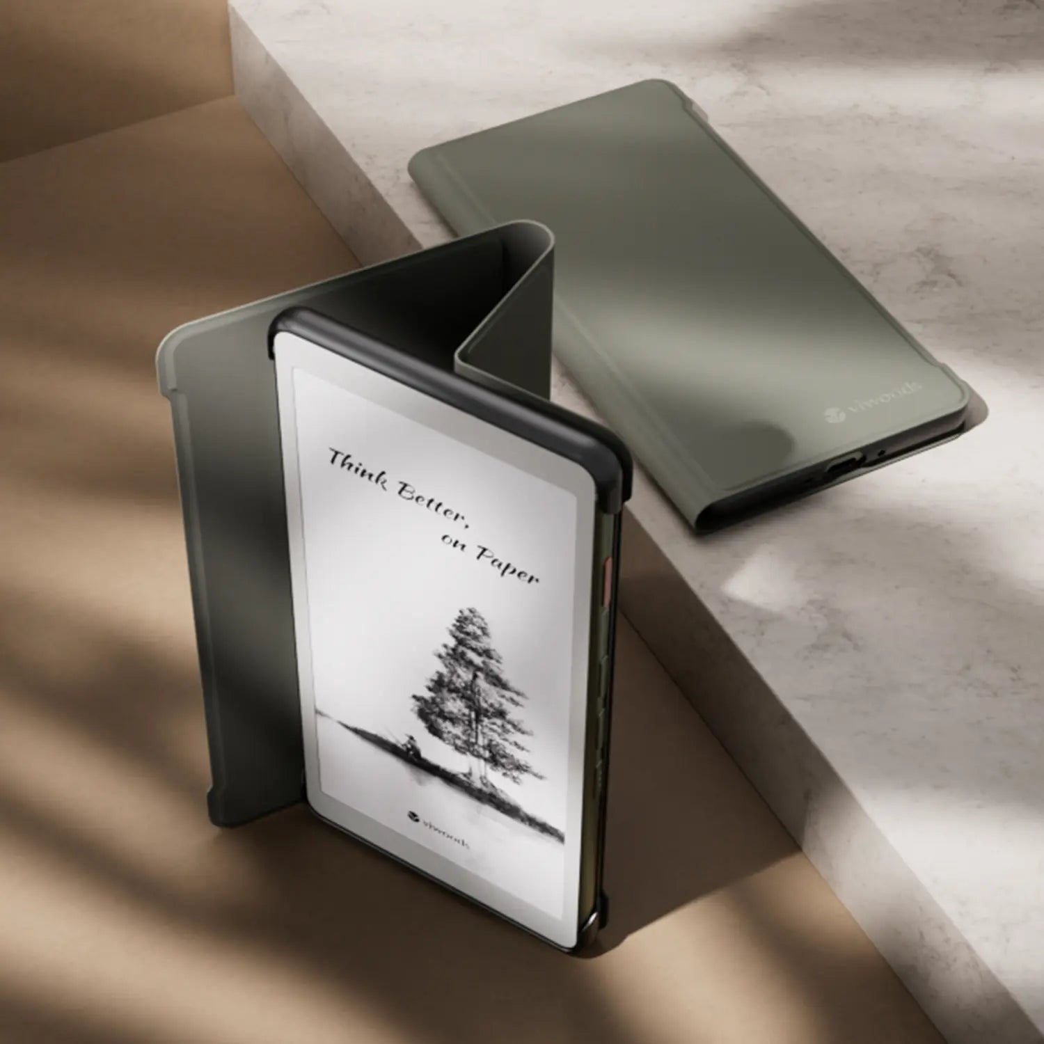
A handling test should follow ordinary moments
Imagine a short reading session on a sofa. The front cover needs somewhere comfortable to rest. Then imagine a meeting note taken on a narrow table beside a laptop. A cover that occupies too much space can become more disruptive there than during relaxed reading.
Next comes handwriting. If the folded panel creates an uneven base, the device may rock slightly as pressure moves across the screen. A small issue in a photograph can become irritating across a long planning session.
These scenarios are more revealing than simply counting features. A case should make the tablet easier to live with when open as well as safer when closed.
MAKE THE DECISION IN THE RIGHT ORDER
Protective Case Decision Checklist
A clear order keeps appearance from dominating the decision too early. First eliminate every case that is not confirmed for the exact device. Then use the dominant routine—not the longest feature list—to decide which protective details deserve priority. Finish, texture, and colour can settle the choice after those checks pass.
Three questions can resolve most close calls
- What happens most often? Long desk writing, short notes, reading, or frequent movement?
- What would become annoying every day? Loose pen storage, extra width, unstable folding, or exposed edges?
- Which feature solves a real risk? Protection should answer an actual routine rather than make the specification list longer.
Once those answers are clear, the current Viwoods protective cases collection can be narrowed by model rather than browsed as a purely visual accessory page.
KEEP THE PRIORITIES SEPARATE
Structure decides whether the case works. Material decides whether the suitable case feels right.
That distinction keeps this decision focused on fit and protection instead of turning it into a fabric-versus-leather comparison.
CHECK THE LIVE LISTING
Verify Current Product Information Before Buying
Accessories are easy to judge from an old photo because the basic shape often remains familiar. That is also why outdated information can be misleading. A previous case version, archived review, or search image may look close enough to create false confidence.
The current product page should settle compatibility, available variants, storage layout, included items, folding behavior, and any model-specific feature that matters. When the text does not confirm something visible in an image, it is safer to leave that feature unconfirmed.
Package contents need the same discipline. A tablet, stylus, replacement tip, or prop can appear in photography without proving that every pictured item comes with the case. Current listing information should remain the reference.
FINAL VERIFICATION ROUTINE
Exact device model confirmed Current compatibility checked Screen and corner coverage reviewed Stylus arrangement checked Open position reviewed Included items verified
Material can finally enter the decision here. Surface feel, appearance, cleaning preference, and personal style still matter. They simply belong after compatibility and protective structure have already passed the test.
COMMON DECISION QUESTIONS
E Ink Tablet Case Questions
How do you confirm a case fits an E Ink tablet?
Start with the complete model name rather than screen size alone. Then compare the active case listing with the device outline, corners, charging position, controls, and stylus arrangement. Similar-looking generations should not be treated as interchangeable unless the current product page confirms compatibility.
Should a case include stylus retention?
Frequent handwriting makes integrated retention much more useful because the pen remains part of the same object. Reading-heavy use may prioritize a slimmer grip instead. In either case, the stylus position should not interfere with closure, charging, folding, or screen clearance.
Is a folio case enough for backpack carry?
A folio can reduce direct screen contact and protect ordinary exposed surfaces, but it should not automatically be treated as protection against heavy compression. Carry conditions differ, so crush or impact resistance should only be assumed when current product information specifically supports that claim.
FINAL CHECK
Fit the case to the routine, not the other way around.
Before comparing products, write down three facts: the exact device model, whether it normally stays at a desk or travels in a bag, and whether the stylus must remain attached. Then compare only compatible cases for screen coverage, corner retention, closure, folded-open comfort, and complete carry size.
A good E Ink tablet case should fade into the background of reading and writing rather than demand attention every time the device moves. Check the live listing once more for compatibility, included items, and model-specific features before making the final selection.
Compatibility note: case fit, accessory layout, included items, and model-specific functions can change. Current VIWOODS product information should be reviewed before publication and final selection.
Guides 紙のような書き心地のタブレット
Paper Tablet for Meetings: Notes to Action Items
E Ink Tablet for Project Handoffs: Review Notes, Open Issues and Next Steps
How to Evaluate an E Ink Tablet Demo for a Business Team
E Ink Tablet for Compliance Audits: Checklists, Evidence Notes and Follow-Up
Fabric vs Leather Tablet Case: Which Material Fits Daily Carry?
E Ink Tablet for Research Interviews: Interview Guides, Field Notes and Follow-Up
Paper Tablet Accessories Checklist: What You Need for Daily Carry
How to Store an EMR Stylus Safely: Protect the Nib, Magnet and Tablet
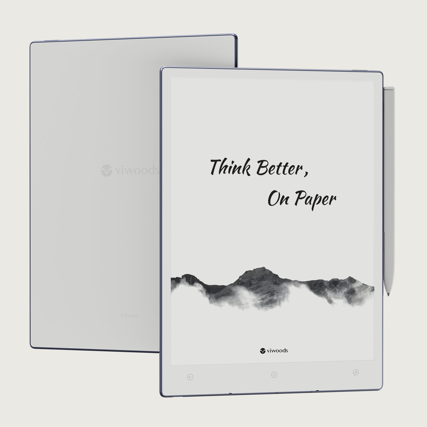
Viwoods AiPaper
$549.00
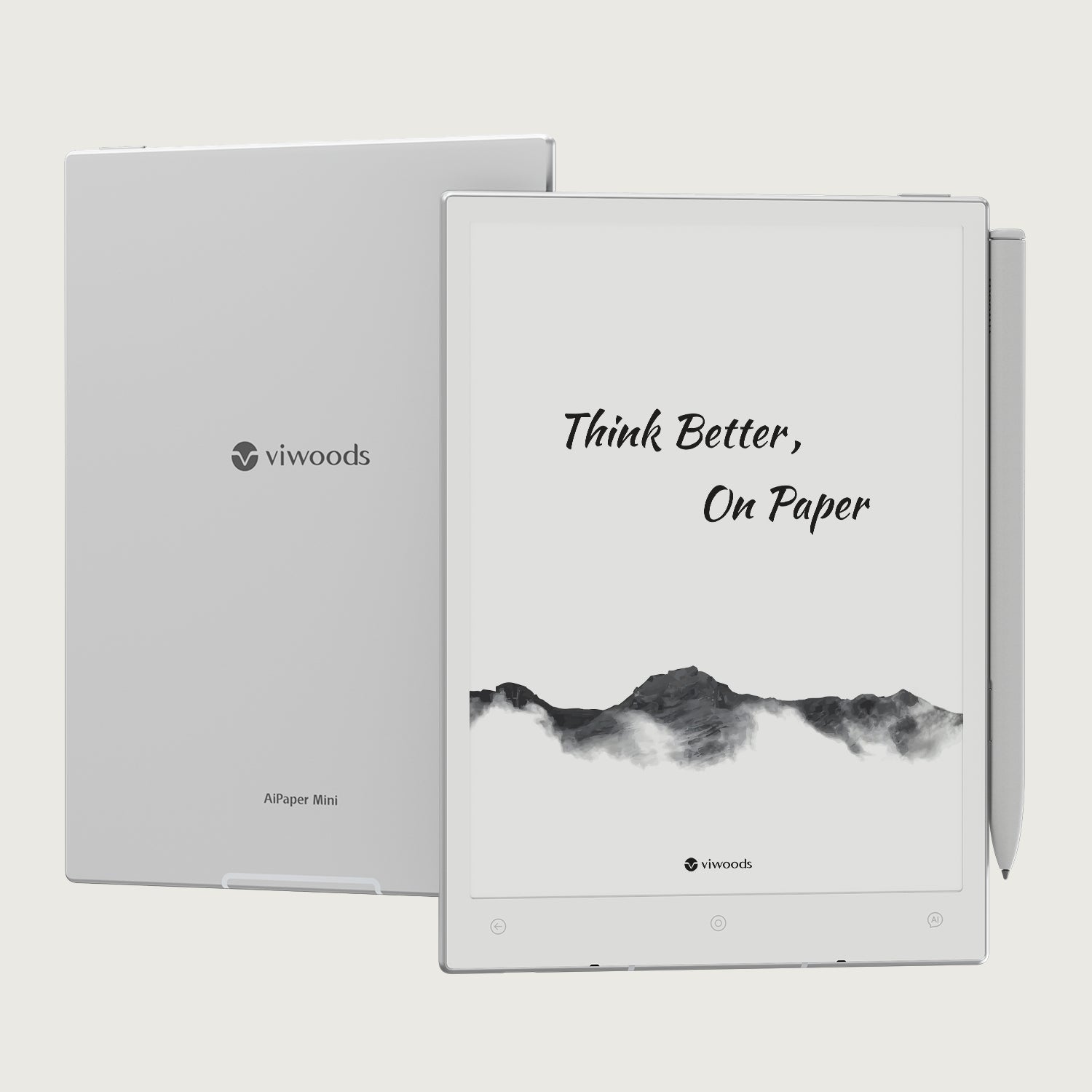
Viwoods AiPaper Mini
$429.00
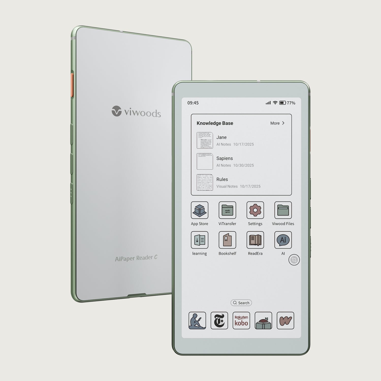
Viwoods AiPaper Reader カラー
$289.00
Viwoods AiPaper Reader
$279.00